# Containers
## Windows
Windows form the foundation of your app. They provide a canvas with basic, built-in actions such as "closing" and "resizing". Although users may see windows as being all the same, elementary OS has several distinct window types. It's important to understand the types of windows available to you, window behavior in general, and behavior that is specific to a certain window type. This section will cover the different types of windows available in elementary OS. Although each type of window is a bit different, think of them all as a subclass of a window. Unless otherwise stated, they all behave as an average window.
* **View Windows** are the most literal kind of "Window" available. They show content such as presentations, web pages, documents, etc., and act as a sort of frame around them. Accordingly, applications typically use multiple view windows to display different instances of content. A "tabbed" view can organize applications that produce many windows.
* **App Windows** are the main windows of apps that are not document-based. Applications rarely use more than a single instance of these windows.
* **Dialogs and Alerts** are temporary windows that require a response from a user. Dialogs and Alerts are especially unique types of windows with much stricter guidelines for their use and visual style. They typically belong to App or View windows and are often modal. We'll discuss what modality means in a bit.
### Window Titles
When dealing with window titles, consider that their main use is in distinguishing one window from another. A good window title will provide a description that helps a user make a selection. Keep that in mind as you consider the following:
* A view window should display the name of the content being viewed. For example, a web browser's window title should reflect the title of the current web page. When looking for a specific window among multiple instances of an app, simply showing the application's name is not helpful.
* A window's title should not show the vendor name or version number of the app. Adding the version number or vendor name clutters the title and doesn't help to distinguish a window. Additionally, this information is already available on your app's page in AppCenter.
* Dialogs and alerts should not display a window title. They are distinctive enough in their visual style and are often modal.
* If you need to display more than one item in the title, separate the items with an em dash (—) with space on either side. The helps keep the title clean when you need to show more information.
* Don’t display pathnames in window titles—only the current destination. For instance, it is hard to distinguish between two similar paths when they are displayed in full. If you only show the destination, the distinction is clear.
Even if your app uses a headerbar, be sure to set the window's title; it can be shown in the window switcher and elsewhere in the OS.
### Preference Dialogs
Preference dialogs should be made Transient, but not Modal. When a user makes a change in a preference dialog, the change should be immediately visible in the UI. If the dialog is modal, the user may be blocked from seeing (and especially from interacting with) the change. This means they will have to close the dialog, evaluate the change, then possibly re-open the dialog. By making the dialog transient, we keep the dialog on top for easy access, but we also let the user evaluate and possibly revert the change without having to close and re-open the preference dialog.
See also:
1. [Why 'Ok' Buttons In Dialog Boxes Work Best On The Right](http://uxmovement.com/buttons/why-ok-buttons-in-dialog-boxes-work-best-on-the-right/) by UX Movement
2. [Why The Ok Button Is No Longer Okay](http://uxmovement.com/buttons/why-the-ok-button-is-no-longer-okay/) by UX Movement
3. [Should I use Yes/No or Ok/Cancel on my message box?](https://ux.stackexchange.com/questions/9946/should-i-use-yes-no-or-ok-cancel-on-my-message-box) on UX Stack Exchange
4. [Where to Place Icons Next to Button Labels](http://uxmovement.com/buttons/where-to-place-icons-next-to-button-labels/) by UX Movement
## Popovers
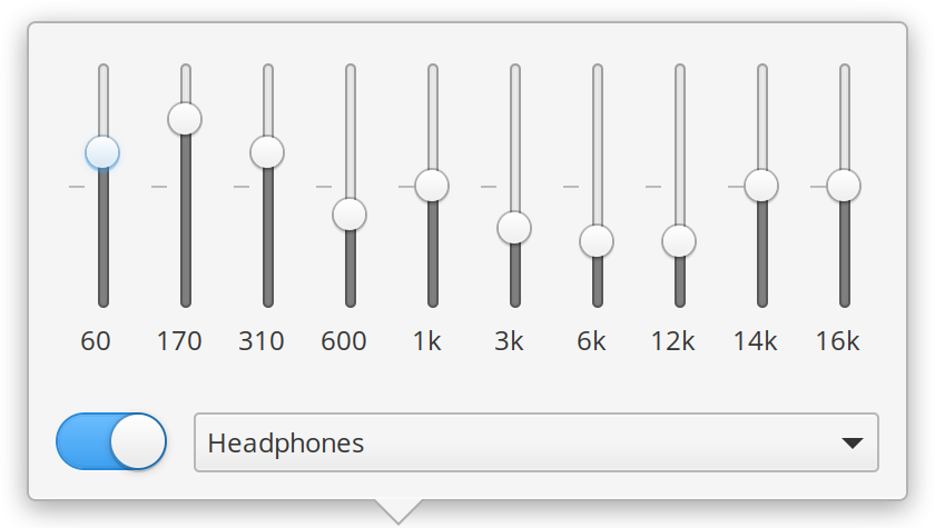
Popovers are like a contextual dialog. They display transient content directly related to something that was clicked on and close when clicked out of, like menus.

A popover should be used when a user wants to perform a quick action without getting out of the main UI. Some examples of where a popover could be used are adding a contact from an email, adding a bookmark in a browser, or displaying downloads or file transfers.
Popovers should not be used when displaying only a simple list of items; instead, use a menu. Likewise, don't use a popover if the user would spend more than a few seconds in it; instead, use a dialog. Remember that popovers are contextual and should directly relate to the UI element from which they spawn.