Loading...
Loading...
Loading...
Loading...
Loading...
Loading...
Loading...
Loading...
Loading...
Loading...
Loading...
Loading...
Loading...
Loading...
Loading...
Loading...
Loading...
Loading...
Loading...
Loading...
Loading...
Loading...
Loading...
Loading...
Loading...
Loading...
Loading...
Loading...
elementary OS uses consistent user interface elements referred to as widgets to bring a unified and predictable experience to users, no matter what app they're using. Correctly using these existing widgets helps ensure a small or nonexistent learning curve for your app.
All about the guiding philosophies we employ
The elementary OS HIG isn't just about a set of concrete rules; it's meant to be flexible and extensible. As such, this very first portion of the guideline is all about the guiding philosophies we employ.
For a quick design crash course, we like "The User is Drunk" on YouTube:
Read on for our four guiding philosophies.
Help users be faster and more confident
Sometimes a user will perform an action which could possibly be destructive or traditionally irreversible. Rather than present the user with a warning, apps should let the user undo the action for an appropriate amount of time. Some prime examples of when this behavior is useful are:
Closing an app. Rather than warning the user, automatically save their work and the app's state so they can return exactly where they left off. See .
Deleting an item. Instead of asking the user if they are sure, make the item "disappear" from the app, but provide an easy and intuitive way to undo the delete.
Sending an email. Rather than asking the user if they want to send an email, let them undo or edit the message a short time after "sending."
Editing a photo. Instead of asking the user if they want to destructively apply an edit, let them undo the edit and always keep the original backed up.
This behavior can be implemented by providing a buffer time between when the app shows the user what happened and actually performing the action, as long as the action is also actually performed if the user closes the window or otherwise navigates away. To keep the experience responsive, the app should always look as if it performed the action as soon as the user initiates it.
This behavior strikes the best balance of keeping out of the user's way while making sure they don't do something unintended. It's important to keep the undo action unobtrusive yet simple and intuitive; a common way of doing so is by using a toast or info bar, though other methods may also be appropriate.
Conventionally, the Ctrl+Z keyboard shortcut should also perform the undo action as long as undoing is possible or valid.
See also: by Aza Raskin
Bringing the desktop in line with modern expectations
Users should feel confident when using elementary OS; they should know that everything they see is saved and up to date.
Apps in elementary OS should operate around an always-saved state. This means that changes the user makes are instantly applied and visible and that making the user manually save things is a legacy or specialized behavior.
For example, a Song Info dialog should update the track information instantly without a user having to press a save button, user preferences should be applied as soon as the user manipulates the relevant widget, and closing an app should mean that reopening it will return to where the user left off.
Visible design is a large part of the user experience, but so is the user's workflow, or how they interact with an app. In this section, we cover a few important steps of a typical workflow:
First Launch Experience: What the user sees the first time they use your app
Normal Launch: What happens when opening your app on a day-to-day basis
: Help users be faster and more confident
: Bringing the desktop in line with modern expectations
: What happens when closing your app
: How your app manages to do things invisibly in the background
Create a beautifully consistent experience on the elementary OS desktop
These guidelines are for interface designers, graphic artists, and software developers working on apps for elementary OS. They not only define specific design elements and principles, but also help instill a philosophy that enables you to decide when it is appropriate to deviate from the guidelines.
Adhering to the suggestions contained here provides many benefits:
Users will learn to use your app faster, because it shares common elements that they are already familiar with.
Users will accomplish tasks more quickly, because you will have a straight-forward interface design that isn't confusing or difficult.
Your app will appear native to the desktop, and share the same elegant look as default applications.
Your app will be easier to document, because an expected behavior does not require explanation.
The amount of support you will have to provide will decrease—including the number of issues filed—for the reasons above.
To help you achieve these goals, these guidelines cover basic interface elements, how to use them and put them together effectively, and how to make your app integrate well with the desktop. The most important thing to remember is that following these guidelines makes it easier to design a new app—not harder.
Keep in mind that this is a set of guidelines, not a rule book. New, amazing interaction paradigms appear every day and more are waiting to be discovered. This is a living document that can and will be changed.
For sections that have not yet been written, please refer to .
Notebooks are a type of widget that lets apps show one of multiple pages (also colloquially referenced as "tab bars").
A Static Notebook is a small set of unchanging tabs, commonly seen in preferences or settings screens. The tabs appear as linked buttons centered at the top of the content area. A Static Notebook should typically contain two to five tabs.
A Dynamic Notebook is a way for an app to provide user-manageable tabbing functionality, commonly seen in web browsers. The tabs appear attached to the toolbar on their own tab bar above the relevant content. Tabs are able to be rearranged and closed, and a "new tab" button is at the start of the notebook widget.
What the user sees the first time they use your app
When a user first launches an app, they should be able to get down to business as quickly as possible. If configuration is not absolutely required for the first use, they should not be required to configure anything. If configuration is required, they should be presented with a clean and simple welcome screen within the app. Avoid separate configuration dialogs when launching.
Your app's first launch is the user's first impression of your app; it's a chance to really show off its design and speed. If your app has to configure things in the background before visibly launching, it gives the user the impression that the app is slow or will take a long time to start up. Instead, focus on making the application window appear fast and ready to be used, then do any background tasks behind the scenes. If the background task is blocking (e.g. the user is unable to perform certain tasks until it's complete), show some type of indication that a background process is happening and make the blocked user interface items insensitive (see: ).
If there is no content to show the user, provide actions they can act upon by using a simple . Let them open a document, add an account, import a CD, or whatever makes sense in the context of the app.
If a user explicitly "resets" the app (ex. by deleting all songs in a music library or removing all mail accounts in a mail client), it should return to its first-launch state.
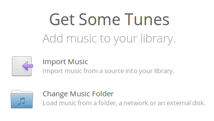
The Welcome Screen is a friendly way to help users get started with your app.
Typically a Welcome Screen is used for apps like Music or Code where you have to import or create objects in a library before you can interact with them. This provides your users with a clear path to getting started and points out any immediate steps they must take before your app becomes useful.
If your app lets users clear its library, make sure that it returns to the Welcome Screen instead of an empty list.
The Welcome Screen consists of two sets of labels:
The first set explains the situation and what the Welcome Screen will help you accomplish. As an example, Music's Welcome Screen explains that your music library is empty and that in order for the library view to become useful, we must import songs into our library.
The second set of labels consists of the actions that will assist a user in getting started with your app. To use Music as an example again, one possible action is setting your music folder to an alternate location. First we name the action, "Change Music Folder". Then, we describe what the action does, "Load music from a folder, a network or an external disk."
Grouped with each action is an icon that helps to quickly visualize it. Most of the time these will be Action icons, but you can use Places icons when importing or setting a location and even Apps icons if you must open a configuration utility.
Windows form the foundation of your app. They provide a canvas with basic, built-in actions such as "closing" and "resizing". Although users may see windows as being all the same, elementary OS has several distinct window types. It's important to understand the types of windows available to you, window behavior in general, and behavior that is specific to a certain window type. This section will cover the different types of windows available in elementary OS. Although each type of window is a bit different, think of them all as a subclass of a window. Unless otherwise stated, they all behave as an average window.
Tool items in a toolbar or header bar should be organized with the most commonly used items at the beginning and the least commonly used at the end. If you have many tool items it may be appropriate to divide them into groups with space in between each group. In general, popovers or menus which contain settings should be placed at the end of a toolbar or header bar.
What happens when closing your app
When a user closes an app, it's typically because they're done using it for now and they want to get it out of the way.
Apps should save their current state when closed so they can be reopened right to where the user left off. Typically, closing and reopening an app should be indistinguishable from the legacy concept of minimizing and unminimizing an app; that is, all elements should be saved including open documents, scroll position, undo history, etc.
Because of the strong convention of saved state, elementary OS does not expose or optimize for legacy minimize behavior; e.g. there is no minimize button, and the Multitasking View does not distinguish minimized windows.
Compound-word widgets (e.g. HeaderBar) should be referred to with multiple words (e.g. header bar).
Apps should never minimize instead of closing, as that puts the app window into a state that is foreign to users of elementary OS. Instead, windows should close or hide and re-open with a saved state. Any ongoing or background tasks should be completed soon after the window is closed, then the app should quit so as to not use unnecessary resources.
App Windows are the main windows of apps that are not document-based. Applications rarely use more than a single instance of these windows.
Dialogs and Alerts are temporary windows that require a response from a user. Dialogs and Alerts are especially unique types of windows with much stricter guidelines for their use and visual style. They typically belong to App or View windows and are often modal. We'll discuss what modality means in a bit.
When dealing with window titles, consider that their main use is in distinguishing one window from another. A good window title will provide a description that helps a user make a selection. Keep that in mind as you consider the following:
A view window should display the name of the content being viewed. For example, a web browser's window title should reflect the title of the current web page. When looking for a specific window among multiple instances of an app, simply showing the application's name is not helpful.
A window's title should not show the vendor name or version number of the app. Adding the version number or vendor name clutters the title and doesn't help to distinguish a window. Additionally, this information is already available on your app's page in AppCenter.
Dialogs and alerts should not display a window title. They are distinctive enough in their visual style and are often modal.
If you need to display more than one item in the title, separate the items with an em dash (—) with space on either side. The helps keep the title clean when you need to show more information.
Don’t display pathnames in window titles—only the current destination. For instance, it is hard to distinguish between two similar paths when they are displayed in full. If you only show the destination, the distinction is clear.
Even if your app uses a headerbar, be sure to set the window's title; it can be shown in the window switcher and elsewhere in the OS.
Preference dialogs should be made Transient, but not Modal. When a user makes a change in a preference dialog, the change should be immediately visible in the UI. If the dialog is modal, the user may be blocked from seeing (and especially from interacting with) the change. This means they will have to close the dialog, evaluate the change, then possibly re-open the dialog. By making the dialog transient, we keep the dialog on top for easy access, but we also let the user evaluate and possibly revert the change without having to close and re-open the preference dialog.
See also:
Why 'Ok' Buttons In Dialog Boxes Work Best On The Right by UX Movement
Why The Ok Button Is No Longer Okay by UX Movement
Should I use Yes/No or Ok/Cancel on my message box? on UX Stack Exchange
by UX Movement
Popovers are like a contextual dialog. They display transient content directly related to something that was clicked on and close when clicked out of, like menus.
A popover should be used when a user wants to perform a quick action without getting out of the main UI. Some examples of where a popover could be used are adding a contact from an email, adding a bookmark in a browser, or displaying downloads or file transfers.
Popovers should not be used when displaying only a simple list of items; instead, use a menu. Likewise, don't use a popover if the user would spend more than a few seconds in it; instead, use a dialog. Remember that popovers are contextual and should directly relate to the UI element from which they spawn.
Keep in mind that when viewed with RTL languages, your app's layout will be flipped.
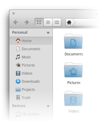
A sidebar may be used as a high-level form of navigation. Sidebars are useful for showing different locations, bookmarks, or categories within your app. A sidebar goes at the left side of a window (or right side for right-to-left languages). Because the user reads in this direction, the sidebar is reinforced as being before (and therefore at a higher level than) the app's contents.
A sidebar may be separated into different collapsible sections, each with its own heading. For example, a file manager might have a section for bookmarked locations, a section for storage devices attached to the computer, and a section for network locations. These sections help group related items in the sidebar and lets the user hide away sections they might not use.
Avoid nesting expandable sections within a sidebar if possible; if you find yourself wanting to do this, you may need to rethink the sections.
Sections in the sidebar should be sorted from most important at the top to least important at the bottom. If you're having a hard time deciding the relative importance of each section, think about which section a user is likely to use more often. Sorting the sections this way ensures that the most important items are always visible, even if the sidebar is too short to fit all of the items, though of course items at the bottom will still be accessible via scrolling.
Windows should have a 12px (minimum) space between any widgets and the window's border.
Labels should be 12px (minimum) from their widgets.
If there are section headers present, labels should be indented.
Horizontal spacing between buttons is 6px.
Widgets should be "Justified" so that they align on both the left and right sides. Do not include "descriptor" widgets such as icons or labels in this justification.
Labels should be right aligned with respect to each other when possible.
Section headers should be left aligned with respect to each other.
See also: Form Label Proximity: Right Aligned is Easier to Scan by UX Movement
Tool Buttons are almost always icon-only and do not provide a button border. They should not be accompanied by a label.
All Tool Buttons should have tooltips, since they do not contain a label. This assists users with disabilities as well as giving a translation for an unrecognized icon. Tooltips should be done in sentence case without terminating punctuation.
Like text button labels, a tooltip should clearly describe what will happen when the button is pressed.
If a button has a related keyboard shortcut that will perform the same action, its tooltip should include the shortcut. See Granite.markup_accel_tooltip () for specifics.
Text Button labels should be done in title case.
Like menu items, Text Button labels should consist of an Action or a Location but not a status. Make sure that a button's label clearly describes what will happen when it is pressed.
"Remove Account", "Transfer to Jim's Laptop", and "Import 20 Songs" are good labels.
"OK", "Get more storage!", and "Low Battery" are not good button labels. The "Get more storage!" label has incorrect capitalization and unnecessary punctuation. The other two labels do not indicate what will happen as a result of clicking the button.
Since Text buttons have a clear and explicit label, it's usually unnecessary to give them a tooltip.
See also:
Why The OK Button Is No Longer Okay by UX Movement
Should I use Yes/No or Ok/Cancel on my message box? on UX Stack Exchange
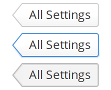
A back button is simply a text button with a special style class. It should be used to navigate back to a previous view, typically from a child view to the main view.
The text of the button should be the title of the previous view. If the button will take the user “home,” then “Home” may be an appropriate label; however a more specific label is preferred, such as “All Settings” in System Settings. Avoid just using “Back,” as the back button is visually distinct and going back is already implied by its unique shape. The button should tell the user where it will take them back to.
When using a back button, it is recommended to use a Gtk.Stack to switch between views. This way you get a sliding animation further representing the backwards progression when activating the back button.
Back buttons are typically seen in header bars, but can be used in other contexts as well.
Selection controls present a way for users to select or enable options. There are several types of selection controls available in elementary OS:
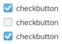
Checkboxes present a way for users to select multiple items from a set.
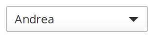
Comboboxes and Radio buttons present a way for users to select a single option from a set.
Linked buttons present a compact way for users to select options that can be described by an icon or with only one or two words.
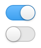
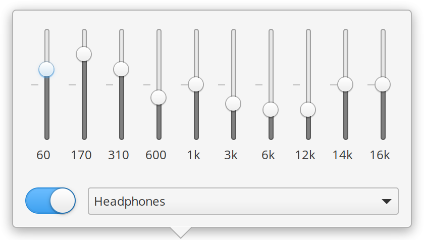
Switches present a way for users to toggle certain features or behaviors "on" or "off".
Use checkboxes when users are making a selection of items. If you have a single option, avoid using a checkbox and use a switch instead.
Make sure that users can toggle the state of the checkbox by clicking on the label associated with the checkbox.
Labels associated with checkboxes should usually be nouns or nounal phrases.
Use a combobox (also called a dropdown) when:
Users are selecting only a single item from a set and
The set is too long to show all available options at once
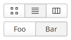
Use linked buttons when:
All options can be described by an icon or with only one or two words and
You think users should see all available options at once.
Linked buttons can be used to select multiple related options like "Bold", "Italic", and "Underline", or they can be used to select a single mutually exclusive option (also called a mode button) like Grid, List, or Column view.
Linked buttons should never contain colored icons. Only 16px symbolic icons OR text. Do not mix icons and text.
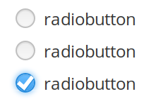
Use radio buttons when:
Users are selecting only a single item from a set and
You think users should see all available options at once.
Use a switch when users are toggling certain features or behaviors "on" or "off".
Don't use switches to select related items as part of a list, instead use a checkbox. Think of switches as acting on independent services and checkboxes as including objects in a list. This is an important distinction to make.
When possible, directly call out the service you are acting on. Do not use words that describe the state that the widget is describing like "Enable Multitouch", "Use Multitouch", or "Disable Multitouch". This can create a confusing situation logically. Instead, simply use the noun and write "Multitouch".
As of elementary OS 5 Juno, mode switches are a new switch-based widget that communicate switching between two distinct states. For example, switching between a photo or video mode in a camera. The switch is drawn smaller and inline with the provided symbolic icons. Tooltip hints can also be provided when hovering the icons.
Use a mode switch when you have two distinct and opposing states that you are switching between that can be effectively communicated via an icon. If you need text or more than two states, use instead.
See also: by UX Movement
What happens when opening your app on a day-to-day basis
When a user launches an app, they're performing an explicit action and expecting a fast, oftentimes immediate response. You should focus on three key areas for app launching: speed, obviousness of what to do next, and state.
As has been said before, speed, especially when launching an app, is very important. There should be as little delay as possible in between the time a user decides to launch an app and the instant they can begin using it. If your app requires a splash screen, you're doing it wrong.
When a user launches your app, they should know exactly what to do next. This is achieved by following the other interface guidelines (ensuring your app is consistent with other apps) and by offering up explicit actions from the get go. If the app typically displays "items," such as songs or emails, let the user get at those items by displaying them when the app opens. If there are no previously-opened items, you should offer to open or create a new item (such as a document) by using a .
If the user has previously used your app, it's typically best to restore the state of the app when opening it again. This means the app comes up to right where the user left off so they can pick up their work again. For a music player, this means opening up with the view where the user left it and the song paused where the user closed the app. For a document editor, this would mean opening up with the same document scrolled to the same spot with the cursor in the same spot on the page.
Always work to make your app instantly understandable. The main function of your app should be immediately apparent. You can do this in a number of ways, but one of the best ways is by sticking to a principal of concision.
It's often very tempting to continue adding more and more features into your app. However, it is important to recognize that every new feature has a price. Specifically, every time you add a new feature:
Your app gets slower, consumes more resources, and takes up more disk space.
Your app's interface becomes more cluttered and thus harder to use.
More time is spent implementing this new feature, rather than perfecting an old feature.
More code can often mean a greater possibility for bugs.
More features means more work on documentation, translations, etc.
Build small, modular apps that communicate well. elementary OS apps avoid feature overlap and make their functions available outside of themselves through and make use of . This both saves you time as a developer (by other apps making their functions available to you), and is a courteous gesture towards other developers (by making your app's functions available to them).
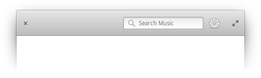
Apps that support the searching or filtering of content should include a search entry on the right side of the app's toolbar. This gives users a predictable place to see whether or not an app supports searching, and a consistent location from which to search. GTK provides a convenient complex widget for this purpose called Gtk.SearchEntry.
Search is for filtering the contents of a library, i.e. Music or Videos, to the matching items. Search is typically initiated when typing anywhere in a library view.
Find is for highlighting matching instances of a string, i.e. in a text editor, web page, or Terminal. It is triggered by a keyboard shortcut (Ctrl+F) or with a search icon. The find bar appears in a revealer below the header bar with relevant actions such as find next, find previous, highlight all, etc. The revealer may also contain other relevant actions such as replace or go to line.
If it is possible to include search functionality within your app, it is best to do so. Any list or representation of multiple pieces of data should be searchable using a search field that follows these rules:
Results should be instantly shown as you type. This helps your app to appear faster and is more useful than having to hit "Enter" and wait. Exceptions may be made if the data is not stored locally.
In most cases, the search should be case-insensitive; users should not be expected to provide the exact capitalization. A good compromise is "smart case" where case is respected whenever the user intentionally types lower and upper case letters.
Search fields should contain hint text that describes what will be search. You can set this using the entry property .
Most search fields should use the format "Search OBJECTS" where OBJECTS is something to be searched, like Contacts, Accounts, etc.
If the search field interacts with a search service, the hint text should be the name of that service such as "Google" or "Yahoo!"
How your app manages to do things invisibly in the background
If it makes sense to continue a process in the background (such as downloading/transferring, playing music, or executing a terminal command) the app back-end should continue with the task and close when the task is finished. If it's not immediately apparent that the process has completed (as with the file download/transfer or terminal command), the app may show a notification informing the user that the process has completed. If it is apparent, as with the music, no notification is necessary.
If an app performs repeat background tasks (such as a mail client fetching mail), the background tasks should be completed by a daemon and not rely on any window being open.
If the user re-opens an app while a background process is still executing, the app should be exactly where it would be if the window had been open the whole time. For example, the terminal should show any terminal output, the music player should be on the same page it was when closed, and the browser should come back to the page it was on previously. For more details, see the discussion of app state on a .
See also: by Matthew Paul Thomas
Before we get into all the things that make up elementary OS apps, there is a clarification that needs to be made. We need to understand what exactly design is about, but more importantly we want to smash two major myths:
Whether you realize it or not, you are constantly designing anything you build. It is an intrinsic part of creating something. Design is not just what something looks like. It's not just the colors and fonts. Design is how it works. When you decide to add a button that does a thing, that is design. You made a decision to add a button with an icon or a label and where that button went and the size and color of that button. Decisions are designs.
See also: Design Is Not Veneer by Aral Balkan
Design is testable. One design will meet a specific goal better than another design. Consider different types of bicycles. A folding bicycle has a different set of design goals than a mountain bicycle. Things like weight, size, and tire tread are important factors in helping the intended user reach their goals. Because we understand that design is about solving specific problems, we must also understand that we can objectively compare the effectiveness of two designs at solving those problems.
See also: Design is Not Subjective by Jeff Law
Providing settings can be a way to make sure an app is accessible to a wider set of users with special needs, but it can also be an easy way out of making design decisions about an app's behavior. Just like with problems of feature bloat, settings mean more code, more bugs, more testing, more documentation, and more complexity. When considering adding options to your app, try to strike a balance of making your app more accessible without pushing design work onto your users.
Design with sane defaults in mind. elementary OS apps put strong emphasis on the out of the box experience. If your app has to be configured before a user is comfortable using it, they may not take the time to configure it at all and simply use another app instead.
Get as much information automatically as possible. Instead of asking a user for their name or their location, ask the system for this information. This cuts down on the amount of things a user has to do and makes your app feel more intelligent and integrated.
Ask yourself if the configuration option you are adding is really necessary to make your app more accessible or if it makes sense to have a user make this decision. Don't ever ask users to make uninformed engineering or design decisions.
Keep things contextual. Instead of tucking away preferences in a configuration dialog, think about displaying them in context with the objects they affect (much like how shuffle and repeat options appear near your music library).
If your app needs to be configured before it can be used (like a mail client), present this configuration inside the main window much like a . Once again, make sure this is really necessary set-up. Adding unnecessary configuration screens stops users from doing what they wanted to do when they opened your app in the first place.
See also:
by Alex Limi
by Zach Holman
There are several ways to provide feedback in elementary OS, depending on the nature and severity of that feedback.
Toasts affirm user action and can provide a contextual action, such as "Undo" and dismiss automatically after a short timeout.
Info Bars provide basic information and can provide a contextual action. They do not obscure other content and are not dismissed automatically.
The primary method of discovering and using your app
An app launcher file (or .desktop file) contains information that will be used to display your app when it is installed, such as in the Applications menu and Dock. It contains an app's name, description, categories, icon, keywords, and associated actions.
For technical information about shipping app launcher files see our
The naming and description portion of the app launcher file should follow this formula:
Name
Interfaces should aim to provide an obvious response to interaction. When an actionable widget seemingly does nothing, this creates confusion and can even be scary for curious new users who are still exploring your app—Think, "uh-oh I don't know what happened!". There are two common ways to avoid widgets that do nothing: setting their sensitivity or hiding them.
Making a widget insensitive informs the user that the functionality is available, but only after a certain condition is met. Hiding a widget is more useful when it doesn't make sense in a given context, or when it would help the UI to feel less overwhelming.
Keep in mind that insensitive items will still be recognized by screen readers and other assistive tools, while hidden widgets will not.
Most users don't want to read through help docs before they can use your app. Instead, they expect that your app will be intuitive and simple for them to understand without assistance.
Avoid technical jargon and assume little-to-no technical knowledge. This lets your app be “self-documenting.”
Provide non-technical explanations instead of cryptic error messages. If something goes wrong, a simplified explanation of what happened and how to fix it should be presented.
Sometimes it doesn't make sense for a user to interact with a widget until some prerequisite is fulfilled. For example, It doesn't make sense to let a user click a browser's "Forward" button unless there is forward history available. In this case, you should make the "Forward" button insensitive or a user may click it, expecting a result, and be confused when nothing happens. A disabled button at the end of a form can help convey that all required fields haven't been filled out yet. A disabled view can draw visual attention to an associated switch that activates a required feature.
All GTK widgets inherit the property sensitive.
When a widget only makes sense in a certain context (not as an indicator of an action to be performed) it often makes more sense to hide it. Take hardware requirements for example: It may not make sense to show multi-display options if the system only has a single display. Making multi-display options insensitive is not really a helpful hint in this context and also serves to add complexity and clutter to your UI.
Consider the "clear" button present in search fields. This button only appears when it is relevant and needed. Setting this button as insensitive only clutters the UI since it's not important to hint to the user that this entry can be quickly cleared once there is text in it.
Hiding a widget can give the impression that functionality is not available at all or can leave a user wondering why a feature has suddenly "disappeared". Be sure that this widget isn't necessary as an affordance.
GTK widgets can be hidden with the property visible, but it's usually nicer to pack them into a revealer in order to provide animations.
The Wizard Anti-Pattern by Stef Walter
For more information, see Writing Style.
You should not include descriptive words in your app's Name. For example, an address book app might be called "Dexter," not "Dexter Address Book." A web browser might be called "Midori," but not "Midori Web Browser." Instead, use the GenericName attribute of your app's .desktop file for a generic name, and the Comment attribute for a longer descriptive phrase.
If your app is easily categorized or described with a generic name, you should use that for the GenericName attribute in your app's .desktop file. If you can say, "My app is a(n) _**__**_," then whatever fits in that blank could be the generic name. For example, Quilter is a markdown editor, so its generic name is "Markdown Editor".
You should not include articles (the, a, an) or the words "program," "app," or "application" in your app's generic name.
The generic name should be in title case and may be used around the system to better describe or categorize your app:
The system uses an app's Comment attribute (found in the .desktop file) to succinctly inform a user what can be done with the app. It should be a short sentence or phrase beginning with a verb and containing the primary nouns that your app deals with. For example, the following are appropriate comments:
Calendar: Browse and schedule events
Mail: Send and receive mail
Files: Browse and manage your files
An app's comment should be in sentence case, not include terminal punctuation (periods, exclamation points, or question marks), and should be as short as possible while describing the primary use case of the app:
Categories are used to sort your app in AppCenter and in the applications menu. In your app launcher file, they should be separated by and terminated with a semicolon:
The full list of supported categories can be found in the FreeDesktop.Org menu entry specification and the list of additional categories
You can add more than one category to your app launcher file and you should add all that apply
You may also include keywords in your launcher to help users find your app via search. These follow the "Keywords" key in your .desktop file. For example, a web browser might include "Internet" as a keyword even though it's not in the app's name, generic name, or description. As a result, a user searching for "Internet" will find the app. Here are some more examples:
Files: Folders;Browser;Explorer;Finder;Manager;
Terminal: Command;Prompt;Cmd;Emulator;
System Settings: Control;Panel;
Keywords should be single words (in title case) separated by and terminated with a semicolon:
See also: Desktop Entry Specification from FreeDesktop.org
Name=Eddy
GenericName=Package Installer
Comment=Install Debian packagesName=DexterGenericName=Markdown EditorComment=Listen to musicCategories=Graphics;Photography;Viewer;Keywords=Foo;Bar;Baz;Message Dialogs can be used to provide extensive information and offer multiple possible actions. They can be used when immediate action is required.
Notifications provide basic information and can be shown whether or not your app is focused. They are usually dismissed automatically and can be reviewed later in the notifications indicator.
Badges and Progress Bars overlay your app's icon in the operating system and convey the status of long running actions whether or not your app is focused.
Toasts are ephemeral in-app notifications overlaid on top of other content used to affirm user action and/or provide a time-sensitive contextual action. After a short timeout, a toast is automatically dismissed. Because they are ephemeral, toasts should follow recent user action when the user is expected to engaging with the app. A toast can offer a contextual action that can be triggered as long as the toast is visible. A toast includes a manual dismiss button, e.g. if it is likely to be covering content the user may be more interested in.
A toast's title should be phrased to affirm user action, even when providing an undo action. For example, "Foo was deleted", while offering an action to "Undo".
Use a toast to affirm user action and provide a contextual action, like confirming content was deleted while offering an undo, or informing the user that an in-app process completed while offering a button to navigate to the result of the process. If you provide a toast in your app to notify of the result of a background process, consider only using a toast if your app window is focused while throwing a system notification if the window is not focused.
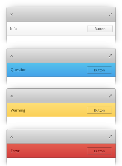
Info bars provide contextual information and actions to the user with varying levels of severity.
It is important to determine the severity or type of info bar to use. There are four types of info bars available:
Information: Supplemental information and an optional action the user may perform. Shows as white in the UI.
Question: A non-critical question for the user. An answer of some sort is expected, but it's not urgent or severe. Shows as blue in the UI.
Warning: Lets the user know something unexpected or bad may happen and provides an action to resolve it. Displays as yellow in the UI.
Error: Informs the user of an error that has occurred and requires a user action to resolve it. Reserved for critical situations. Displays as red in the UI.
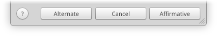
A message dialog contains both primary and secondary text as well as clearly labeled buttons.
The primary text contains a brief summary of the situation and offers a suggested action. Primary text should be in sentence case without terminating punctuation, except in the case of questions.
The secondary text provides a more detailed description of the situation and describes any possible side effects of the available actions. It's important to note that a user should only need the primary text to make a decision and should only need to refer to the secondary text for clarification. Secondary text should be in sentence case with terminating punctuation.
Granite.MessageDialog is the prefered way to create message dialogs with the correct layout
All dialogs should contain an affirmative button that performs the action suggested in the primary text. This button should be aligned to the very end of the dialog.
For dialogs that are displayed in response to user action (such as "Quit"), provide a "Cancel" button directly before the affirmative button.
If your dialog has alternative actions, list them before the "Cancel" button.
If your dialog has incidental actions (actions that do not close the dialog such as "Help"), these should be aligned to the start of the dialog.
When presenting a dialog to a user, always use explicit action names like "Save..." or "Shut Down". Consider how "OK" lets users proceed without understanding the action they are authorizing. Not all users will read the question or information presented to them in a dialog. Using specific action names will make it harder for a user to select an unintended action and may even encourage them to read the presented information before making a selection.
If the primary action is not destructive, its button should be given the .suggested-action style class, rendering it in a highlighted style by default. It should usually be focused by default so it's quicker for the user to perform the action using the keyboard.
If the primary action is destructive—i.e. it cannot be easily reversed or undone—it should be given the .destructive-action style class, rendering it in a red style by default. Destructive actions should not be focused by default to prevent accidental activation.
Multiple suggested and/or destructive actions should not co-exist in the same context; there should only be one of either type in a dialog.
Notifications play a sound and are displayed as bubbles just below the system indicators. They briefly appear on screen where they can be selected to open the relevant app or manually dismissed by hitting the X icon. After a short time, they automatically slide away. Missed notifications can be seen in and cleared from the Notification Center indicator.
Notification titles should be in sentence case without terminating punctuation, except in the case of questions.
Notifications play a system sound by default, but app developers are able to set an appropriate app-specific sound for users to be able to more quickly recognize the source of the notification. Be sure to use the notifications API via LibNotify to set the sound so that it respects user settings and does not play a duplicate sound.
By default, a notification will include the icon of the app that sent it. For certain apps, it might make sense to display a different relevant image along with a notification, like a user avatar if it's a communication app or album artwork if it's a music app.
Keep in mind that users are in ultimate control over notifications and whether or not they appear. Being overly aggressive with your notifications is a quick way to get the user to turn them off entirely or even uninstall your app.
Users can enable Do Not Disturb mode from Notification Center or System Settings. Do Not Disturb blocks all notification bubbles and sounds until it is manually turned back off.
Notification bubbles, sounds, and appearance in Notification Center can each be toggled on or off on a per-app basis from the system notifications settings. Instead of including a global toggle for all notifications in your app, direct the user to the System Settings using a settings URL to open the Notifications page directly.
Make progress bars unambiguous by referring to a single, specific task. For example, use progress bars to indicate the status of lengthy processes like file transfers and encoding. Do not use progress bars to compound the progress of different types of action.
Good Example: Installation progress in AppCenter
Bad Example: Combined progress of downloading an album, burning a CD, and syncing a mobile device in a music app
A badge shows a count of new, actionable items managed by your app. Its purpose is to inform the user that there are items that require user attention or action without being obtrusive. This is a passive notification. A badge should not show totals or rarely changing counters. If the badge is not easily dismissed when the user views your app, it is likely that this is not a good use of a badge.
Good Example: New messages since an app was last opened
Bad Example: Total number of photos in a photo library
Note that in a mail or chat app, a strict "unread" counter may not be the most useful. Instead, your app's badge should count new unseen messages, e.g. messages that have come in since the last time the user opened your app. Otherwise it may just always be some large, daunting number rather than providing the most relevant information at any given moment.

Although elementary OS primarily uses graphics as a means of interaction, text is also widely used for things like button labels, tooltips, menu items, dialog messages, and more. Using text consistently and clearly both in terminology and format is an extremely important part of designing your app and helps add to the overall cohesiveness of the elementary OS platform.
Writing Style. Keep your text understandable and consistent with the rest of elementary OS.
Language. Keep other languages in mind.
Capitalization. What, when, and where to capitalize.
Punctuation. Avoid common mistakes and follow convention.
Using Ellipsis. When, where, and why to use ellipsis.
Naming Menu Items. Keep your menus clear and consistent.
Use the following rules to keep your text understandable and consistent:
Don't give the user a bunch of text to read; a lengthy sentence can appear daunting and may discourage users from actually reading your messaging. Instead, provide the user with short and concise text.
Bad: It doesn't look like you have any music in your library. You can use Music to organize your music, add more, and listen to the music you already have. To get started, click on the "Add" button, then follow the prompts. Once you're done, your Music will be displayed here.
Better: Get Some Tunes. Music can't seem to find your contacts. [Buttons to import or create contacts]
Assume the user is intelligent, but not technical. Avoid long, uncommon words and focus on using common, simple verbs, nouns, and adjectives. Never use technical jargon.
Bad:37 audio format files have been successfully imported into the songs database.
Better: Successfully added 37 songs.
Put the most important information at the beginning of your text. If the user stops reading, they'll still have what they need in mind.
Bad: Your network connection might be down because Lingo could not find any definitions. Check it and try again.
Better: No definition found. Check your network connection and try again.
Repetition can be annoying and adds unnecessary length to your messaging.
Bad: Your email address, [email protected], has been added. To access [email protected], click on "[email protected]" above.
Better: Your email address has been added. To access it, click "[email protected]" above.
Visual hierarchy aids users in reading and comprehending your text as well as knowing what is most important. Use headings and other text styles appropriately.
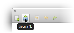
Bad:
No files are open. Open a file to begin editing.
Better:
No files are open.
Open a file to begin editing.
While much of elementary OS is developed in English, there are many users who do not know English or prefer their native language. While putting text into your app, keep the following in mind:
Make it translatable. Always, always make your text translatable using the built-in methods. It can't be translated if you don't make it translatable. Include punctuation in translatable strings.
Avoid culture-specific references. Remember that users of another language are going to be using your app. Specific metaphors or references will likely be lost on or downright confusing to other those users. Instead, use universal text.
Keep differences in mind. Remember that other languages and cultures often use different currencies, date formats, punctuation, and more. Always keep these things in mind when developing your app's text, and use the system-provided methods for translating these items when possible.
All textual user interface items, including labels, buttons, and menus, should use one of two capitalization styles: sentence case or title case.
Sentence case means you capitalize like in a standard sentence or phrase.
Only the first letter of the phrase and the first letter of proper nouns are capitalized. Used for labels and descriptive text.
ex. "Always open MPEG files with Marlin" next to a checkbox.
ex. "Read news feeds" for the description of an RSS reader.
ex. "This folder is empty" in a file manager.
Title case means you capitalize like a book or article title. In elementary OS, we follow the .
Capitalize the first and last words.
Capitalize all nouns, pronouns, adjectives, verbs, adverbs, and subordinate conjunctions (as, because, although).
Capitalize all words that are more than three letters long.
Used for titles, buttons, menus, and most other widgets.
ex. "Open File" title in a dialog.
ex. "Delete 13 Songs" on a button.
ex. "Search Contacts" in a search bar.
Proper nouns should always be capitalized properly; this means that, for example, Google should always be shown as "Google," and MPEG should always be shown as "MPEG." One major exception is "elementary." It should follow the brand guidelines and always appear lowercase, even at the start of a sentence. If you're unsure how a certain pronoun should be officially capitalized, refer to the documentation of the pronoun in question.
Keep in mind these are the rules elementary OS follows for English; capitalization for other languages should follow the conventions of those languages.
Proper typography is important throughout elementary OS. Not just for consistency within the OS, but for following proper convention and presenting ourselves as a serious, professional platform.
Whether or not to use terminating punctuation (like a period . in English) depends on context. For secondary labels in , use terminating punctuation. For single-sentence copy in tooltips and other clarifying contexts, avoid terminating punctuation.
For multi-sentence copy in clarifying contexts, use standard terminating punctuation. If there are single-sentence labels in the same context (alongside multi-sentence labels), terminating punctuation may be used for consistency.
For questions, always include terminating punctuation (i.e. a ? in English).
Only use one space after a period.
i.e. “This is a sentence. This is another sentence.”
Use a proper ellipsis character (…) rather than three dots.
Use \u2010 in code. Used for:
Joining words (e.g. non-breaking).
If the word cannot be split along lines (e.g. UTF-8), use a non-breaking hyphen (- \u2011).
Use \u2013 in code. Used for:
Number ranges (e.g. 5–12). Do not put a space on either side.
Use \u2014 in code. Used for:
Interjections (e.g. the party—which was scheduled for Thursday—was delayed).
Do not put a space on either side.
Quote offsets.
If in doubt, refer to .
These rules apply to the English language; other languages may have their own conventions which should be followed by translators.
The ellipsis character (…) is used in the interface for two primary reasons: informing the user of an additional required information and letting the user know text has been shortened.
An ellipsis should be used to let a user know that more information or a further action is required before their action can be performed. Usually this means that the user should expect a new interface element to appear such as a new window, dialog, toolbar, etc in which they must enter more information or make a selection before completing the intended action. This is an important distinction because a user should typically expect an instant action from buttons and menu items while this prepares them for an alternate behavior. More specifically, an ellipsis should be used when the associated action:
Requires specific input from the user. For example, Find, Open, and Print commands all use ellipses because the user must select or input the item to find, open, or print. An easy way to remember this is to think of a question requiring and answer: Find what? Open what? Print what?
Is performed in a new window or dialog. For example, Preferences, Report a Problem, and Customize Toolbar all use ellipses because they open a new window (sometimes another app) or dialog in which the user makes a selection or inputs other information. Consider that the absence of an ellipsis implies the app will handle the action immediately. This means that the app will automatically generate a report or customize its own toolbar. Using an ellipsis makes the important distinction that the user will be writing the report or selecting which toolbar items to show.
Ellipses should be used when shortening text that cannot fit in any specific place. For example, if a playlist's name is longer than the space available in the sidebar, truncate it and use an ellipsis to signify its truncation. There are two ways to use an ellipsis when shortening text:
End truncation. If the important or distinctive text is at the beginning of the string, truncate it at the end and append an ellipsis.
Middle truncation. When the end of the text is more important or distinctive, truncate the text in the middle and replace the truncated text with an ellipsis.
If you're unsure, it's best to use middle truncation, as it keeps both the beginning and end of the string intact. It's also important that you do not ship your app with any truncated text; truncation should only be the result of a user action such as resizing a sidebar or entering custom text.
In an entry's placeholder text. An ellipsis is not necessary here and adds no value.
For a submenu item. The right arrow already indicates that this entry spawns a submenu and is not an action.
Be sure to use the actual ellipsis character (…) rather than three consecutive period (.) characters.
Menu items should have names that are either actions or locations, never descriptions. Make sure menu items are concise, but also fully describe the action that will be performed when they are clicked.
"Find in Page..." is acceptable as it clearly describes the action that will be performed when the item is clicked. "Software Up to Date" is not acceptable. What happens if I click this item? Where will it take me? What will it do? The outcome is uncertain.
Right-to-left. It's easy to forget about right-to-left (RTL) languages if you're so used to using left-to-right. Make sure your app still works well when used with RTL layouts, and always use RTL-compatible widgets when developing your app.
Use \u2026 in your code.
See Using Ellipses for usage details.
For quotes, use proper left and right double quotation characters (“ and ”).
Use \u201C and \u201D in your code.
In contractions and possession, use a right single quotation mark (’) as an apostrophe.
Use \u2019 in your code.
Use real math symbols for subtraction (−), multiplication (×), and division (÷) signs.
Use \u2212, \u00D7, and \u00F7 in your code.
Use correct copyright symbols (©).
Use \u0169 in your code.
Use superscripts where needed (e.g. 1st).
New line, space to the right.
Iconography is a key part of elementary OS. Icons make up the majority of the UI that your user will be actively engaging with; they're what bring the system to life and cater to the powerful recognition engine of the human brain.
Your icon should have a distinctive shape/silhouette to improve its recognition. This shape should not be too complicated, but the icon should not always be a rounded rectangle.
For example, if your icon's metaphor lends itself well to a unique shape, use that shape for the overall icon shape instead of placing that shape onto a generic rectangle, square, or circle.
If you're creating an icon for a hardware device or a file type (such as those for MimeType or Device icons), its shape is typically a visual representation of its real-world counterparts. For example, the icon for a camera is a stylized camera.
Action icons are used to represent common user actions, such as "delete", "play", or "save". These icons are mostly found in app toolbars, but can be found throughout the OS.
If your app makes use one of these common actions, reference its corresponding icon instead of creating your own. This ensures a consistent user experience and aids in user recognition of common functions.
If your app has a unique action, you may need to create your own. When doing this, try to follow the look and feel of existing action icons, and include it along with your app.
elementary OS uses six main icon sizes throughout the OS and it's best to include all six as part of your application.
16 24 32 48 64 128
128
Design each icon for the size it's meant to be viewed at. In other words, do not design one icon and resize it to fill the remaining sizes, the best result is when each icon is designed individually. For more information about this practice (called "pixel-fitting") and its importance, we recommend reading .
Color—don't be afraid to use it! Many of the elementary OS icons use vibrant colors; it's best to reserve muted tones and grays for boring system icons.
Colors do have their connotations, so be cognizant of this when picking them. For instance: red is usually associated with error or "danger", and orange with warnings. But you can use these color connotations to help convey your icon's meaning, such as green for "go". We use the .
Symbolic icons are common system icons that symbolize files, devices, or directories, and are also used to represent common actions like cut, copy, and save.
Each symbolic icon is a reduced form of its full-color counter part. This minimal design ensures readability and clarity even at small sizes.
The use of full-color and symbolic icons is not interchangeable; both have appropriate uses.
Full-color icons are best used for:
application icons
files and mimetypes
device icons
Symbolic icons are best used:
on buttons
in lists or text fields
for status indicators
There are three aspects to note when designing an elementary OS icon:
Its baseline (highlighted in blue), to ensure that all icons of one size line up along the bottom when in a row (much like text).
Its mean line height (green), also known as the center line of the canvas.
Its x-height (shown in red), or "how tall" the icon is.
Keeping these lines in mind while designing, means you can place elements along them to ensure that icons appear more consistent when put together. For example, notice how some elements in both the Terminal and Videos icons above relate to the mean line.
If you're designing a square-shaped icon, like the one for Terminal seen above, then consider using these common measurements (in pixels) for each icon:
However, there are exceptions. Many icons (especially mediatype icons) have ascending and descending elements, which are those elements that extend beyond the base line and x-height line (shown here in orange).
Rounder components will generally require some overshoot, to compensate for the optical illusion that makes them look smaller than their rectangular counterparts.
All elementary OS icons have a thin outline (stroke) to improve their contrast. The width of this stroke is one pixel for all icons, at every size. The color of the outline is a darker variant (30% darker) of the primary color of the icon. For instance, in the calendar icon below, the green header has a stroke of a darker green.
To further improve contrast, strokes are also semi-transparent. This ensures that icons appear sharp against a variety of backgrounds. Also, if the element is near-white, this stroke acts as a border and contains, rather than overlaps, its corresponding element. See the above icon for an example of this.
If you picture an icon sitting on a shelf, facing you, with a light source above it, you may see a small fuzzy shadow near the bottom. Also, since the edges of an object tends to reflect more light due to your position relative to it and to the light source, they will have a highlight. Both these effects are something elementary OS icons emulate in their design to lend them a degree of realism.
To apply the edge highlight effect to your icon, draw a subtle, 1 pixel, inner stroke as a highlight. This outline is slightly brighter at the top and the bottom than it is at the edges.
To draw the shadow, you'll start by drawing a rectangle. Then fill it with a linear gradient that is perpendicular to the bottom margin of the icon. The gradient has three stops, the first and last of which have zero opacity. Then this entire shape is set to 60% opacity.
Next create two smaller rectangles to "bookend" the larger. Fill each with a gradient identical to the first, but make it radial instead. Center the radial gradient in the middle of a short edge with each stop directly out to the nearest edge—see below for an example. Both these rectangles are also set to 60% opacity.
If your icon has a pictogram, such as the play triangle in the icon below, you can give it a drop shadow to make appear extruded from the background of the icon.
To do this, first duplicate the pictogram, fill it with solid black and set it to 15% opacity. Next, shift it 1 pixel down and place it below the pictogram. Create a copy of this shadow and give it a 1 pixel stroke (also black) and adjust this element to 7% opacity.
Alternatively, you can also use a highlight and shadow to make the pictogram appear inset into the background.
You are free to add gloss (extra highlights) to your icon but this is only a good idea if you're emulating a surface that is more-reflective in real life (such as plastic, glass, etc.) For instance, a sheet of paper is not glossy therefore a icon emulating paper would not be either.
Below are some "do and don't" examples to consider when creating icons for your app.
Your icon should not be overly complicated. Keep in mind that since there are smaller sizes, the elements that make up your icon should be distinguishable when at those sizes.
Your icon should make use of transparent elements, and should not simply be full-frame images. Where you can, distinguish your icon with subtle yet appealing visuals.
Don't make a thin icon. Your icon's weight should be comparable to that of other icons. An overly thin icon won't stand out well on many backgrounds.
48x48
3
40
24
64x64
4
56
32
128x128
9
104
64
If you would like to give your icon a tilted perspective, it should tilt backward (not forward).
Avoid simply slapping an element onto a base shape; use a unique outline to make your icon more distinct.
Take care to properly add light and shadow to inset or extrude foreground elements.
16x16
1
14
8
24x24
2
20
12
32x32
2
26


16